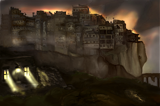
I debated with my lecturers whether I should keep the tree behind the house, however I soon decided it was far too awkwardly positioned in the composition and trying to establish the right amount of lighting was difficult, without the tree making the composition look too unbalanced. Without the tree, the piece appears more symmetrical and allows more focus on the house in the foreground. I don't regret including more detail, and adapting this piece as the previous composition seemed too illustrative and stylised. I received good feedback on the previous piece, especially on the aforementioned point but I need to focus on concept environment, where the backgrounds should look a bit more realistic.
I am happy with the development in this piece, but I may include more light sources and contrast to allow the fires to stand out.
